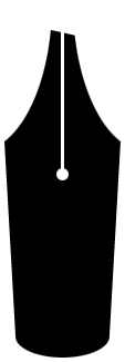
Fountain
pen nibs are made in a bewildering array of sizes and styles.
Of course, covering everything about every kind of nib in
one article would be bewildering as well—I won’t
do that—but there should be enough useful information
to help you better decide what nibs might best suit your writing
style. In this article, I’ll pretend to be knowledgeable
about the following aspects of nibs:
- Nib
tip shapes
- Nib
sizes and types
- Problems
Nib
Tip Shapes
There
are three basic nib shapes: Round, stub,
and italic. Ball point, oblique,
and calligraphy nibs are merely slight variations
of the round and italic shapes, and I’ll discuss these
variations in their appropriate contexts..
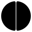
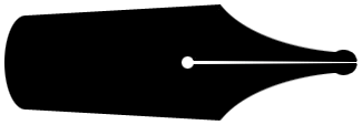
Round
Nibs: A round nib is ground and polished
to have roughly a circular footprint, so that its line width
is fairly uniform no matter what direction the nib is moving
across the paper. I say “roughly” because the shape
is rarely a true circle. Nibs are small, and hands are big.
Grinding a nib to a geometrically perfect shape by hand just
isn’t possible, but this is one area in which “close
enough” really is close enough. Here is a magnified silhouette
representing the basic shape of a round nib, together with
a cross illustrating the uniform stroke width that this nib
produces:
A ball-point
nib is like a standard round nib, but it is also ground and
polished so that you can write with it while holding the pen
with its nib on the underside instead of in the usual nib-uppermost
orientation. This gives a finer line, so that you can have,
in effect, two different nib sizes on one pen. Parker was
famous for the quality of its ball-point nibs. Sheaffer’s
Feathertouch nibs are also ball-point nibs, and Sheaffer included
a ball-point nib among the choices it offered for the interchangeable-nib
Fineline series of pens that it produced to compete with Esterbrook.
(But note that Fineline nibs are not interchangeable
with Esterbrook’s Renew Point nibs!)
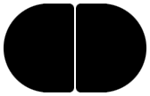
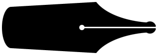
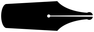
Stub
Nibs: A stub nib is elongated sideways,
to have a footprint that is somewhat elliptical. This makes
it lay down a slightly broader line when moving up and down
(in relation to the nib itself) and a narrower one when moving
sideways (again, in relation to the nib). The eccentricity
of the ellipse isn’t too pronounced, and the nib is still
polished to have nice rounded edges. This means that you can
write with a stub just about as easily as with a standard
nib. Here is a magnified silhouette representing the basic
shape of a stub nib, together with a cross illustrating the
slight variation in stroke width that this nib produces:
Italic
Nibs: An italic nib is much more elongated.
This makes the difference between its broad (up-and-down)
strokes and its narrow strokes (sideways) much more pronounced
than with a stub. There’s a readily perceptible straight
edge across the tip of an italic. Here is a magnified silhouette
representing the basic shape of an italic nib, together with
a cross illustrating the more extreme variation in stroke
width that this nib produces:
When
you write with an italic, you hold the pen with the nib generally
away from your forearm (as with a stub or a round nib). I
mention this point here because you hold a pen with an oblique
nib differently, and I’ll describe that difference later.
When used by a right-handed person, an italic will generally
make strokes that are of roughly equal width in both the vertical
and horizontal directions; strokes from the upper right to
the lower left will be thinner, and strokes from the upper
left to the lower right will be thicker, as shown here:

This
is the stroke arrangement most commonly seen in Old English
and other blackletter styles and in many italic and Chancery
styles:
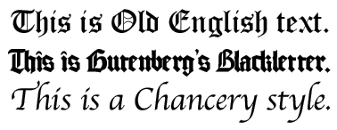
The Old
English text shows additional ornamentation that would be
applied with a very fine dip-pen nib called a “crow quill.”
(The illustrations here were actually produced using typeset
fonts, but they are characteristic.)
Left-handed
writers use so many different writing styles, overwriting
and underwriting, writing uphill, writing horizontally, and
writing downhill, that it’s not really possible to illustrate
a typical left-handed writer’s results. Depending on
the way you position your hand and align your paper, your
broad and narrow strokes will be aligned in directions different
from those of a right-handed writer, and likely different
even from those of other left-handed writers. You’ll
have to experiment for yourself.
As you
might have guessed by now, italics and calligraphy
nibs are the same thing in terms of form; but a calligraphy
nib might be even wider yet. Italics are finished with relatively
less rounding to their edges than round or stub nibs. This
square-edged grind and the wider footprint result in a greater
tendency to catch on corners and a greater tendency to skip
if the nib isn’t held straight-on to the paper (i.e.,
when one side of the nib lifts away due to the nib’s
being rocked sideways). Writing too rapidly with an italic
tends to produce scratchiness and skips.True calligraphy nibs
are often even squarer than italics; the intent is to give
a very crisp and controllable line width. This is why you
can’t just pick up an italic or a calligraphy nib and
dash off a note the way you would with your usual nib. You’re
forced to write more slowly in order to retain control of
your writing. But with practice, some writers become very
proficient with italic nibs, producing beautiful text.
Now we
come to the the oblique. An oblique is exactly like
an italic except that it’s cut on a slant. The oblique
shown in the following figure is a right oblique; it looks
like a right foot when viewed from the top. A left oblique
is cut on the opposite slant. In this figure, the italic is
on the left and the oblique is on the right:
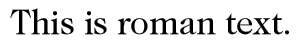
When
you write with an oblique, you must change the orientation
of the pen in order to make the nib’s flat surface contact
the paper. A right oblique, when used by a right-handed person,
will be oriented with the nib generally away from the body
rather than the forearm. This will give broader strokes when
the pen is drawn toward or away from the body and narrower
strokes when the pen is drawn sideways across the body. In
general, this is ideal for producing letters shaded in the
way roman type is shaded, with thick verticals and thin horizontals,
as seen here:
Left-handed
writers, both underwriters and overwriters, will generally
have better success with a left oblique than with a right
oblique; at least, the left oblique will be easier to hold.
As with an italic, you’ll need to experiment to find
the best oblique for you.
Nib
Sizes and Types
Nib
Sizes: Nibs are made in five basic size designation:
Extra fine (XF), fine (F), medium (M), broad (B), and double
broad (BB). As you might expect, some manufacturers make additional
sizes, such as a triple broad (BBB). There is no international
standard that specifies the exact sizes for nibs, so different
manufacturers will make nibs that are somewhat different in
size. The tips of modern nibs seem to be a little larger,
generally, than those of vintage nibs of the same designation.
I suspect that this is so because over the years a broader
line has become more popular, perhaps because of the influence
of the ballpoint pen, so that the nib that produces a line
of “usual” size is larger than it used to be. (There
are technological limitations on how small a ballpoint can
be and still work; a medium ballpoint produces a broader line
than the average vintage medium fountain pen nib.)
Japanese
nibs tend to be a little finer than their Western equivalents;
a Japanese M nib is about the same size as a European F. If
you’re an antiquarian account who writes with a tiny
spidery hand, a Japanese XF might be just what you need.
Nib
Types: When I speak of nib types, I’m referring
to flexibility or the lack of it.
Most
pens today—as did many in the past, including Duofolds
of the 1920s and the sturdily-built Sheaffer Triumphs of the
1940s—have nibs that run firm to rigid; they have little
or no flexibility. These nibs stand up very well to being
used with a firm writing pressure; and this is probably a
good thing, because most modern writers have learned to write
using a ballpoint, which requires a firm pressure. Among vintage
pens, you may find nibs labeled Manifold. These are very rigid
nibs designed to be used under enough pressure to make two
or three carbon copies. Some fountain-pen users dismiss nibs
this rigid, calling them “nails,” but these nibs
do have a purpose. George Parker, in manufacturing the revolutionary
Duofold—one still hailed by many collectors as one of
the best pens ever—chose to install a nail-like nib in
a vast majority of the Duofolds his company produced. The
many people who bought these pens and the thousands who collect
them today outnumber the few who disparage firm nibs as “nails.”
In fact, for the majority of users, “nails” are
actually better than flexible nibs, and this was as true 80
years ago as it is today. That’s why modern nibs are
firmer: It makes sense to the majority of people to use this
kind of nib. That being said, I reside on the crotchety side
of the fence myself, and I carry a pen with a very firm nib
only when I expect to be signing credit-card receipts.
Sooner
or later, nearly every fountain-pen user will discover flexible
nibs. Flex nibs, which were more common in the earlier part
of the 20th century but are still available today, produce
interesting and attractive stroke variation with only an ordinary
round tip. As you press more firmly, the nib’s tines
spread, and the stroke grows broader. Flex nibs have been
made in semi-flexible, flexible, and super-flexible variants;
a super-flex will do under relatively light pressure the same
things that a semi-flex does with more pressure. By choosing
the proper degree of flexibility you can fit your nib to your
writing style without risking a nib that becomes sprung from
the application of too much pressure. The difference between
what a flex nib will do and what an italic or oblique will
due lies in the fact that the italic or oblique produces its
stroke variation, for the most part, in specific directions,
as described earlier in this article. A flex nib, on the other
hand, can produce a broad or narrow stroke in any direction;
this yields a handwriting that its users extol as being much
more characterful and personal, citing the uniqueness of every
individual’s particular combination of stroke direction
and pressure. Mastering a flex nib isn’t easy, but many
users find it well worth the effort.
The ultimate
flex nib for some writers is a flex italic. With a flex italic,
your writing takes on a combination of italic and flex characteristics,
thinner than expected in some places and as broad as the Pacific
Ocean in others. Writing with a flex italic is difficult to
master—even more so than a regular flexible nib. Flex
italics have all the bad handling characteristics of both
of their parent types. They are not for the faint of heart.
Some
makers, notably Moore, attempted to produce nibs that were
a delicately-balanced compromise between flexibility and the
rigidity needed for making carbon copies; Moore labeled its
nibs of this type as Maniflex, and most of them are more nail-like
than not.
Problems
A nib
can misbehave for several reasons, some of which are simple
maintenance problems of dirt, oil, or clogging. (If you use
cheap paper, for example, fibers can become lodged in the
slit and inhibit the flow of ink.) But beyond these common
maintenance problems, nibs can suffer flaws of manufacture
or be damaged by improper use. I’ll discuss a few of
the more common such problems.
Too
Dry or Too Wet: If a nib writes but refuses to lay
down enough ink to satisfy you, it’s possible that the
slit is too narrow for your writing style. Similarly, if the
line is always too wet, the slit might be too wide. The slit
width needs to be different for nibs of different sizes; that
is, an XF needs a very tight slit if it is not to throw too
much ink, while a BB needs a slit more nearly the width of
the Grand Canyon to supply the large quantity of ink needed.
But there’s a balance here; too narrow a slit produces
a dry writer, and a slit that’s too wide dumps more ink
than the nib can handle, leading to uneven lines and slow
drying.
As a
general rule, the nib tines should not touch each other when
the nib is at rest. The firmer or more rigid the nib, the
more important it is that the tines not touch; if they do,
the nib is likely to suffer an extreme case of the “too
dry” syndrome. As with most rules, however, there is
an exception. A flexible nib’s tines touch at the tip
when the nib is at rest; in fact, they are slightly sprung
so that if you move one tine slightly up or down, the two
tips will overlap very slightly.
Loss
of Line: A nib’s slit must conform to certain
restrictions of shape. The slitting process, performed with
a very thin abrasive wheel, produces a slit that is perfectly
straight; that is, the slit’s sides are the same distance
from each other along the slit’s length, as shown here:
The nibs
in most inexpensive and moderately-priced pens go to market
this way, and for the most part these nibs perform reasonably
well. Occasionally, a nib with a straight slit will have difficulty
maintaining capillary action and will stop writing from time
to time. This is more common in broad nibs, whose slits are
wider. A quick shake will usually restart the nib, but it’s
an annoyance, and it creates the risk of splattering your
companions. Worse, if your name is Lewis Waterman, you risk
destroying an important insurance contract and having to find
a new line of work.
Better-quality
nibs, which are hand finished, usually exhibit a slight taper
to the slit. You can see, upon close examination, that the
tines are slightly closer together at the tip than they are
at the breather hole:
A tapered
slit is more conducive to the proper capillary action, and
nibs with tapered slits are usually more reliable writers
than those with straight slits.
A more
severe loss-of-line problem can occur if a nib’s slit
has an inverse taper; that is, if the slit is wider at the
tip than it is at the breather hole:
In this
case, capillary action has an uphill battle from the outset,
and the pen will probably refuse to write more frequently
than it actually writes. This problem can occur when a nib
is sprung by the application of too much pressure. When this
happens, the loss-of-line problem is aggravated by the fact
that the tines, which are now bent slightly upward, are no
longer in proper contact with the feed. An inexperienced repair
person may diagnose this problem incorrectly as a feed that
isn’t set properly, and he or she may simply re-set the
feed without solving the real problem.
Hard
Starting: This is the condition that occurs when
a nib doesn’t start laying down ink immediately upon
contact with the paper. The most common nib-related cause
of hard starting is slit edges that are improperly ground.
Look at the round nib silhouette, repeated below. Note the
slight rounding of the edges where the slit is cut through.
If these edges are not rounded, the nib is likely to be scratchy.
Many inexpensive modern pens, and some not so inexpensive,
have nibs that suffer this fault. But if the slit edges are
rounded too much, capillary action will hold the ink too far
away from the paper instead of drawing it toward the paper
as intended, and the nib will have trouble starting. This
condition is shown on the right in the figure here:
If your
nib starts after a little extra push and then writes well,
the fault may well be slit edges that are too round. Nibs
with too-round slit edges tend to be very smooth, so there
is a delicate balance between too round and just right.
In
Conclusion
Different
people write different ways. The important thing is to experiment
and have fun; and whatever nib style you like, don’t
let anyone disparage the nib—or you—because, in
the end, no one’s right or wrong or more elegant or less
elegant. The only mistake any fountain-pen user can make is
never to try a different style nib.
© 2001 Richard F. Binder
|