|
Introduction
This article will compare two pens, the vintage Pelikan 100 and the modern “Originals
of their Time” re-issues of the same. I will also discuss a custom nib unit
that can be added to the modern pen to essentially transform it into a ‘new’
vintage pen.
The Pelikan 100 model was first introduced in 1929 and went through a series
of changes until the middle of 1931 when it settled down to the model that was
produced until 1944. Interestingly, none of the re-issues are of the model 100
per se, but of slightly different versions. The first of the series, model 111
has a gold barrel and black cap. The 110 has a white gold barrel and cap. The
101 came in marbled green, red, blue, tortoise shell, and lizard (only the blue
and green were re-created as limited editions). The last of the series was the
Toledo, model T111, released in March of 2003.
In this article I will go over each major component of the pens, starting
with a general overview. The pens will be referred to as follows: 100 –
the original and 100LE – the limited edition.
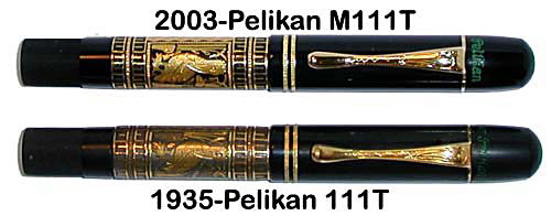
Pelikan Toledos from the collection
of Rick Propas, photography by Rick Propas.
Pen
100/100LE: This is a thin and light pen (0.5”/13mm;
15g), different from most modern models, Pelikan or otherwise. While there are
pens that are similar in length when capped (4.5”/114mm), there are none
that I know of that expand as much when posted (6.25”/159mm). The width
of the pen helps during this growth spurt, as the pen is still well balanced when
posted. The pen fits well in the hand and its thin section is easy to adjust to.
That said, it can be considered an acquired taste. I know many fountain pen users
who find a thick section more comfortable.
Nib/Feed
100LE: The nibs on all of the "originals"
series pens are very different from their vintage counterparts. While they have
a vague resemblance to those of the 1930s, one only needs to look closely to see
the differences. The nib is 18kt gold, with the Pelikan name printed over it.
It has a different shape, making it look shorter and wider than the vintage nibs,
and is nowhere near as flexible. The nib is buttery smooth on paper.
The ink flow is adequate, not too wet and not too dry. The nib has a modern
feed seen on other Pelikan models, with many thin vanes perpendicular to the nib
itself. The collar has a metal ring around it to prevent cracks when removing
and resetting the nib and feed.
100: The vintage nibs on all my 100 models are 14kt
gold and have a little more tooth than the modern nibs. One explanation is the
tip: on the modern nibs the tip is round when looked at sideways, while the vintage
tip is a little flatter. This may be due to age and the wear of the tip over the
years. The nib is nice and flexible, leaving a nice line on paper with variation
and shading.
The ink flow on my vintage pens is generous, leaving a nice wet line with
plenty of variation and shading. The three large vanes on the feed run parallel
to the nib itself, with the entire nib unit made from ebonite. The collar is about
twice as long as the re-edition.
Barrel
100/100LE: The barrel is made of celluloid and has a
variety of sleeves that cover it between the cap and piston knob. The re-issues
with the Toledo and gold sleeves are nicely done, whereas the ones with celluloid
sleeves are slightly lumpy and not as uniform compared to the vintage celluloid
sleeves.
100LE: The section on the re-editions is made of
black celluloid and has a distinct seam where it attaches to the barrel. The threads
are on the section itself and not on the barrel as in the vintage version. The
section continues for about 1mm after the threads end before attaching to the
barrel, which is why the seam is so prominent on some of my “originals”
pens.
100: The section on the vintage pens is made of
hard rubber and was later changed to celluloid. The threads are on the barrel,
not on the section. The section attaches to the barrel exactly where the threads
end, which is why there appears to be no seam. Careful observation with a 10x
loupe reveals the almost invisible seam, however. The vintage pen appears to have
better quality construction because of this, despite the modern manufacturing
methods used in the re-issue.
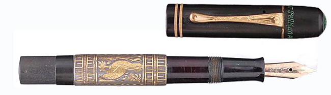
Pelikan Toledo from the collection of
Rick Propas. Photography by David Isaacson.
Piston
100LE: The ridged piston turning knob is made
of hard rubber and looks almost identical to the vintage one, except for the imprinted
arrow to show the turning direction. The modern pen has a slightly larger and
crisper arrow. The piston looks very similar to the vintage version, but is in
fact a modern design. The piston ‘screw’ comprises the piston itself
and has the seal on one end. This connects to the sleeve which is attached to
the knob. On the vintage pen the configuration is reversed, with the screw being
attached to the knob and the sleeve making up the piston with the seal on the
tip. The modern version appears to be a better design because the diameter of
the portion attached to the knob is greater and therefore more resistant to the
shearing force when the piston is operated. A common point of failure in vintage
pens is the connecting point between the piston screw and the turning knob.
100: Besides the differences mentioned above, the vintage
100 has a cork seal. While functional, this means it requires more maintenance.
If the seal dries up it loses some of its sealing properties and might cause the
pen to leak or not fill at all. This problem is not as prominent if the pen is
kept filled with water when not inked. Cork is also more biodegradable than plastic,
which means it will wear out faster and need to be replaced. This is a minor issue
with the many experienced pen repairers available out there.
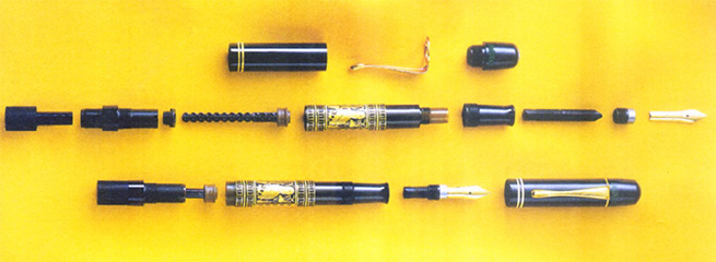
Exploded view of modern Toledo - image
courtesy of Pelikan
Cap
100LE: The cap and cap top are both made of black celluloid.
The cap top is engraved with the word “Pelikan” on one side and the
limited edition number on the other. On the very top is the engraving with the
Pelikan and its four babies in the nest, identical to the vintage engraving. The
cap design is almost the same as the vintage version. The main difference is that
there are no air vents. Otherwise it is a barrel with two gold rings on the end
where it posts, and a cap tip that screws into the other end of the barrel, sandwiching
the clip.
100: The cap on the vintage pens is made of hard
rubber on the early models and celluloid on the later ones. The design is the
same as above but there are variations in the number of holes in the cap as well
as the internal construction where the section reaches when capped. They were
made with two or four holes at various points in time. The vintage caps also had
different engravings on the cap top. My vintage pens have “Pelikan PATENT”
repeated around the cap top.
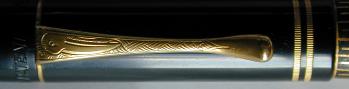
Clip and ring - image courtesy of Pelikan
Clip
100/100LE: The clip on both vintage and modern
pens appears to be identical except for “Germany” and “metal”
engravings on the inside of the modern clip. It is made from a sheet of metal
with the tip folded over to give it a thick, almost teardrop, shaped end. My vintage
pens are a little worn, so you can see where the clip end was folded. The modern
pens show the same fold but it is harder to see unless you specifically look for
it.
Vintage Nib Unit – The best of both worlds*
The modern
limited edition is an interesting pen. It looks virtually identical to the vintage
100 down to the smallest details. It is small compared to modern pens and especially
modern limited editions which tend to be large and elaborate. It is as if you
found a window in time, went back to the 1930s, and bought a Pelikan 100, until
you put nib to paper. That is when you realize it is still a modern pen. Despite
the beautiful look and feel in the hand, the pen lacks the warmth and character
– some call it soul - that you find with the vintage 100s.
Thanks to Pelikan’s conservative and consistent pen designs over the
years there is a solution. The nibs on Pelikan pens screw out and can easily be
replaced. As it turns out, the nibs of both modern and vintage Pelikan 400s have
the same thread pattern as the “originals” series limited editions.
This means you can take that wonderful vintage nib off your Pelikan 400 and put
it directly on the limited edition. This completely transforms the pen from a
sterile writing instrument to one full of character, painting the words on the
page rather than just writing them.
After the initial glee from the discovery comes the sad realization: you have
to share that nib with your 400 and your limited edition. Luckily, Rick Propas
was able to masterfully craft a nib unit specifically for the limited edition
pens. The nib unit is a mix of parts from different years, usually a 100N or early
400 nib and a 100N or 400 feed, married and reset with a 140 or modern 200-400
collar. Regardless of origins, it writes beautifully. He even goes as far as trying
to match the engraving on the nib to the correct year for the pen – a 1935
nib for the 1935 limited edition. The only tell-tale sign that this nib unit is
a modern contraption is the four vane feed under the nib. The older three vane
feeds of the original 100 are not the right size for the collar that fits in the
modern pens, so a compromise was made. It is not at all a bad compromise, because
the whole idea behind the custom nib unit is to get the modern pen to write like
its vintage cousin, which it does admirably.
Conclusion
The vintage Pelikan 100 model is a remarkable pen that introduced the piston filler
to the mainstream fountain pen world. Pelikan rightfully decided to honor its
history by creating re-editions of the original pens in the “Originals of
their Time” limited edition series. The pens are very close replicas of
the vintage models, with slight modernization to the piston design and nibs. Unfortunately
for vintage lovers the worst part to modernize is the nib, and that is exactly
what Pelikan did. The modern pen writes very well but seems a little disjointed.
It looks and feels like a vintage pen but writes like a modern one. Thankfully
there is a solution - to replace the modern nib with a customized vintage nib
unit. This is indeed the best of both worlds: you get a modern pen, a replica
of its typically rare and expensive vintage ancestor, and it writes exactly the
same! I now have vintage nib units for all my limited edition Pelikans and they
are all wonderful writers that I actually use instead of just ogle.
Editor’s Note: The discussion of the custom vintage
nib units created by Rick Propas is unsolicited by me, nor is it endorsed by Pentrace.
The author is in no form being compensated for his discussion or endorsement of
that conversion.
Bibliography
1. Dittmer, Lehmann, 1998, Pelikan Writing Instruments.
Text © 2003 Felipe Jordão. Photos © 2003 as indicated
in captions. Editor: Rick Propas
|